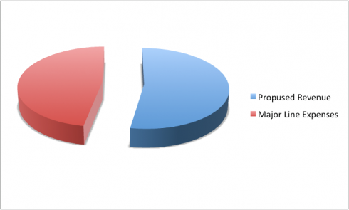
This pie chart compares that our revenue will exceed the expenses for the purposed year.
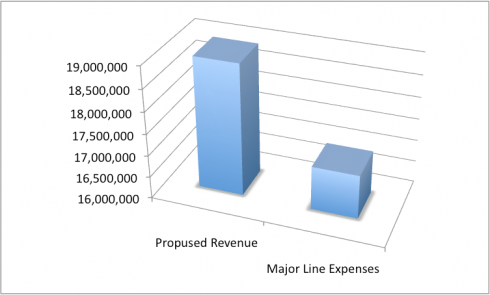
This bar graph compares that our revenue will exceed the expenses for the purposed year.
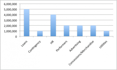
This chart shows the proposed revenue sources for the year. (19 Million)